On-chain data is hard to read, but Artemis makes it simple. It gives clear charts, real metrics, and tools anyone can use. The best part is that Artemis offers a free “Lite” plan for its crypto research tools. This provides access to both the Artemis Terminal and Artemis Sheets.
In this guide, we explore how Artemis cuts through the noise. It shows you what is really happening on-chain. If you want clarity, this is where to start.
What Is Artemis?
Artemis is a crypto research tool. It makes on-chain data clear, simple, and useful. It offers a comprehensive view of market and fundamental metrics. For example, with,
- Price.
- Volume.
- TVL.
- Daily active addresses.
- Developer activity across dozens of chains, applications, and NFT projects.
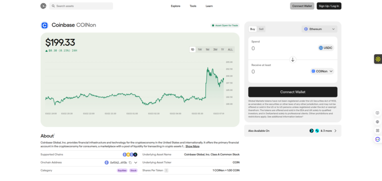
Below is a sample of the Bittensor ($TAO) dashboard.
Source: Bittensor dashboard
This allows you to compare performance, identify trends, and track on-chain activity. The best thing is that there’s no need for extensive data engineering skills. The same goes, of course, for analysts, and protocol teams.
Crypto networks produce huge amounts of raw data every second. Most people never see it. Even experts struggle at times to read it. Artemis solves this in a very user-friendly way. It turns that chaos into clean charts, easy dashboards and visualizations, and real insights. Anyone can understand these.
At its core, Artemis pulls data from blockchains. For instance, Ethereum, Solana, Sui, Aptos, and many more. It tracks everything. Like transactions, active users, gas fees, token flows, developer activity, and network growth. With Ethereum, you can check the impact the Fusaka upgrade has.
It doesn’t give you spreadsheets or complex tools. Instead, Artemis shapes this information into visual stories. It allows you to spot trends fast, compare chains, or dig into a single protocol with a few clicks.
Smart Dashboards
Artemis also includes “Smart Dashboards.” These dashboards highlight the most important signals each day. Think of rising TVL, sudden user spikes, or a drop in activity. Now, this saves you hours of research. It allows traders, builders, and analysts to act early. See the picture below, it shows some stats in the main dashboard. More on this in a moment.

Source: Main dashboard
You can compare ecosystems. This is one of its strongest features. Artemis places chains side by side. Now, you can see which one is growing faster, is gaining users, or attracting more capital.
In short, Artemis is the clearest window into what blockchains are doing right now. It turns raw data into real understanding.
What Tools Does Artemis Offer?
First, I will take a look at the free options of the platform. For us, the smaller users, we still need to continue doing the handmade work. There’s an AI option, however, that is for the paid version. More on this later. Having said that, one of the great features of Artemis is that it can download CSV files. You may know them better as Microsoft Excel or Google Sheets. There are, of course, dozens of other variations available to you. This is a great way to store data in a table-like format with rows and columns.
This feature is the ‘Artemis Sheets‘. It lets you pull live or historical blockchain metrics directly into Excel. Once loaded, the data updates automatically. There’s no need to manually download CSVs from various sources. This allows you to build spreadsheets, do analysis, or build custom dashboards. You can now export data for further manipulation, exactly like traditional financial tools. In the free version, you can download 3 CSV files per month.
Let’s look at some on-chain data tools that the platform offers.
Assets
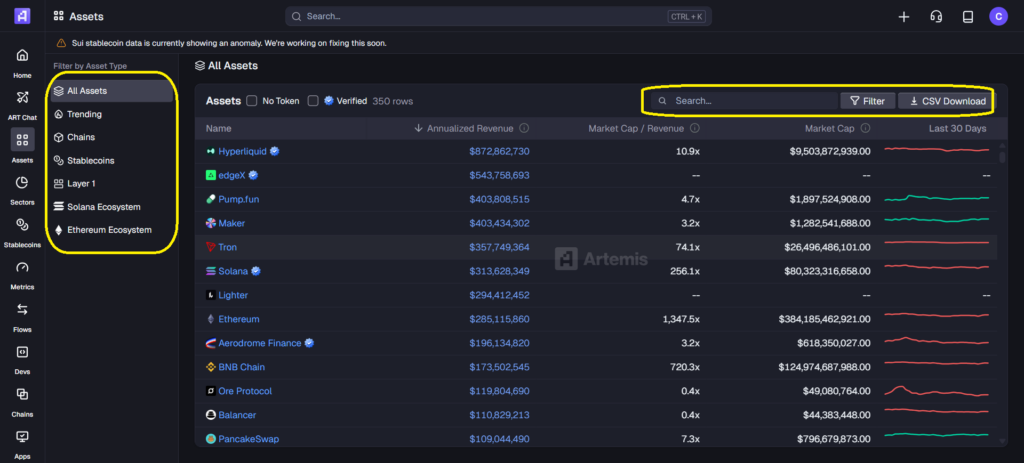
Source: Assets
This shows you all assets that the platform tracks. It offers 7 categories, on the left side of the page. See the yellow box in the picture above. These categories range from ‘all assets’ to ‘trending’ or ‘chains’. Each category offers information like,
- Name.
- Annualized revenue.
- Market Cap / Revenue
- Market Cap
- Last 30 days.
In the top right part of each page is a search box, a filter option, and a CSV download button. See the yellow box. You can click on a specific name in each category, and a new dashboard opens. It will look like the Bittensor dashboard, the first picture in this article.
Sectors
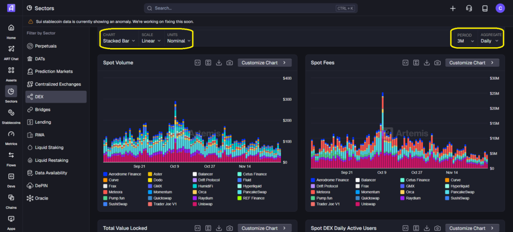
Source: Sectors
Here you can search in 13 different sectors. They range from perps, DATs, DEXes, RWA, or oracles. Each sector has sector specific data charts. All sectors have a ‘Last 24-Hour Data (7D Change %)’ list as well. You have various features to play around with. For example, chart, scale, period, aggregate, and unit options.
Stablecoins
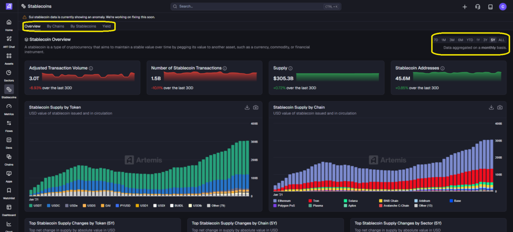
Source: Stablecoins
This offers an overview by token and chain supply. You can further research by chains, by stablecoins, or yield. Each option shows a variety of data/charts. There’s also an option to set time frames from 7 days to 5 years. You can see which stablecoin supply is growing the fastest. That’s one of the first signs of new liquidity coming onto a chain and ecosystem, and it’s bullish for that chain. Even if the price performance says otherwise.
Metrics
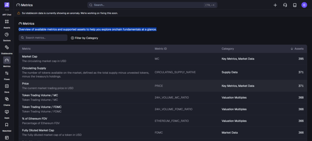
Source: Metrics
Here you can find an overview of available metrics and supported assets. These will help you explore on-chain fundamentals at a glance. You have close to 100 different metrics available to you. You can choose by category, and it tells you how many assets the metric lists.
This gives you an idea what kind of data you can find on the platform. Other research options include,
So, plenty of data are available at your fingertips. It’s easy to research, easy to understand, and easy to use. Flows, in particular, are a great fundamental to watch. When money is moving from ETH to Solana, you want to see how much to see if it’s bullish for Solana or bearish for Ethereum. Or both. Or neither. It helps you find the truth about the projects you follow.
Artemis’ latest tool is ART Chat. This uses AI for crypto analytics. However, it was free to use until November 30th. Now it’s only available in a Pro or Enterprise version. The Pro version will set you back $300 per month or $3,000 annually. Enterprise options have custom pricing.
Meet ART Chat — the AI for crypto analysts.
Available in Terminal & Sheets/Excel. pic.twitter.com/zRp67RAk5P
— Artemis (@artemis) November 10, 2025
Conclusion
Artemis is one of the best tools for anyone who wants clear and honest on-chain data. It cuts through noise and also gives you charts that make sense at a glance. Furthermore, the platform is easy to use. You don’t need to be a data expert or know how to code. Its dashboards help you see real trends fast. It guides smarter research. You can track chains, compare ecosystems, or study a single project. All this without getting lost. Artemis also offers a strong free plan, which makes it great for beginners and pros. If you want better crypto research with less effort, Artemis is the right place to start. It’s one of our most highly recommended tools at Altcoin Buzz, and we hope you try it for yourself.

Disclaimer
The information discussed by Altcoin Buzz is not financial advice. This is for educational, entertainment and informational purposes only. Any information or strategies are thoughts and opinions relevant to accepted levels of risk tolerance of the writer/reviewers, and their risk tolerance may be different from yours.
We are not responsible for any losses that you may incur as a result of any investments directly or indirectly related to the information provided. Bitcoin and other cryptocurrencies are high-risk investments, so please do your due diligence.
Copyright Altcoin Buzz Pte Ltd.
The post Artemis Helps Us Understand On-Chain Data appeared first on Altcoin Buzz.